The Japandi color palette proves that less is more, but choosing the right colors isn’t as easy as it looks. One wrong choice and your room can go from feeling warm and cozy to dull and lifeless. So, how exactly do you choose the right Japandi colors?
The Japandi palette brings together two beautiful styles. It mixes the light, airy tones of Scandinavian design with the warm, earthy hues of Japanese tradition. The result? A space that feels calm, balanced, and peaceful. And here’s the good news: you don’t need to be a design expert to make it work. It’s simpler than you think, and we’re here to show you how.
In this guide, we’ll cover everything from the best Japandi colors to how to use them, and the exact paint shades to bring this style to life.
At the end of this article, you’ll know exactly which Japandi color palette works best for your home and how to use it without overthinking.
What is the Japandi Color Palette?
The Japandi color palette is a beautiful mix of two design styles: Scandinavian and Japanese. Scandinavian design loves light, airy colors like soft whites and grays. Japanese design, on the other hand, brings in warm, earthy tones like beige, brown, and muted greens. When you combine them, you get the beautiful Japandi color scheme.
Now that you know what defines Japandi colors, let’s look at the best color shades and how to incorporate them into your home.
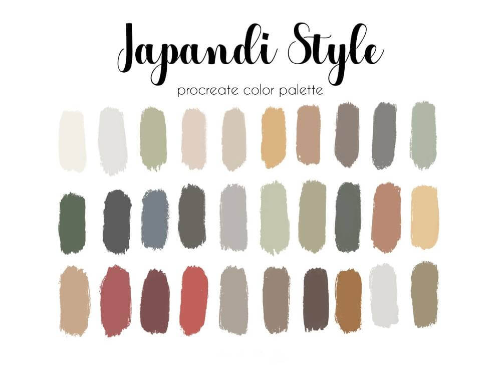
Key Colors in the Japandi Style Color Palette
Here are the key colors that define this beautiful style, along with tips on how to use them in your home:
1. Creamy White
Creamy White is the backbone of the Japandi palette. It’s a warm, soft white that makes a room feel bright and open without being too stark. Use it on walls, ceilings, or large furniture pieces to create a serene backdrop that lets other colors shine.
2. Warm Beige
This is the color of a cozy blanket or a sunlit sand dune. Warm Beige adds depth and comfort to a space, making it feel grounded and inviting. Use it for rugs, upholstery, or even an accent wall to bring a sense of warmth and balance.
3. Muted Gray
Muted Gray is the cool, calm friend in the group. It’s not too dark, not too light—just the right amount of neutral sophistication. Pair it with lighter tones for contrast or use it as a base for furniture, curtains, or decor accents.
4. Sage Green
Sage Green is like a walk through a quiet forest, calming, refreshing, and deeply grounding. This earthy green brings a natural touch to any space. Use it in small doses, like throw pillows, plants, or decor accents, to add a pop of life without overwhelming the room.
5. Charcoal Gray
Charcoal Gray is the bold statement piece of the palette. Its deep and dramatic tones add the right amount of contrast. Use it sparingly in furniture, decor, or even a statement wall to give the space a modern, polished edge.
6. Blush Sand
Blush Sand is a soft, warm hue that bridges the gap between pink and beige. It adds a subtle pop of color to the Japandi palette, offering a hint of warmth without overwhelming the senses. Use it for textiles, like cushions or throws, to create a cozy and inviting atmosphere.
7. Warm Taupe
Warm Taupe is a rich blend of brown and gray, exuding comfort and sophistication. It is versatile and grounding, which is ideal for furniture, flooring, or wood elements. It pairs well with both light and dark hues, enhancing the overall sense of harmony.
8. Golden Straw
Golden Straw is a warm, inviting shade that captures the golden hues of natural straw. This color adds a sunny, optimistic touch to spaces, reminiscent of sunlight filtering through a window. Use it in textiles or accents to bring a cheerful warmth to the minimalist Japandi aesthetic.
9. Earthy Clay
Earthy Clay is a deep, warm terracotta color that embodies the natural elements central to Japandi design. This hue adds depth and character to spaces, evoking the raw beauty of earthenware. Use it in decorative elements, textiles, or as an accent wall to infuse rooms with a grounded, rustic charm.
10. Moss Green
Moss Green is a soft, muted green with a hint of gray, reminiscent of moss-covered stones. This color reinforces the Japandi connection to nature, bringing a peaceful, organic feel to the interiors. Use it in soft furnishings, like cushions or curtains, or add plants in this shade to enhance the natural, calming atmosphere.
How to Use the Japandi Color Palette in Your Home: A Room-by-Room Guide!
The Japandi color palette is about creating spaces that feel calm, balanced, and timeless. But how do you bring this beautiful style into every room of your home? Don’t worry, we’re here to help you with that.
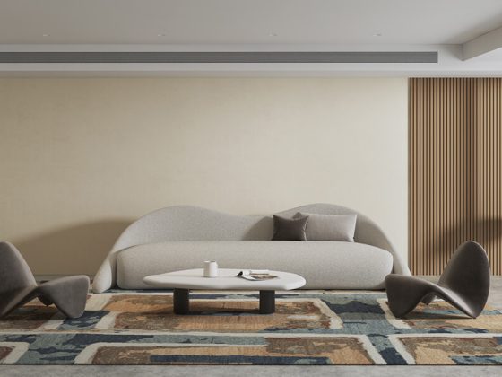
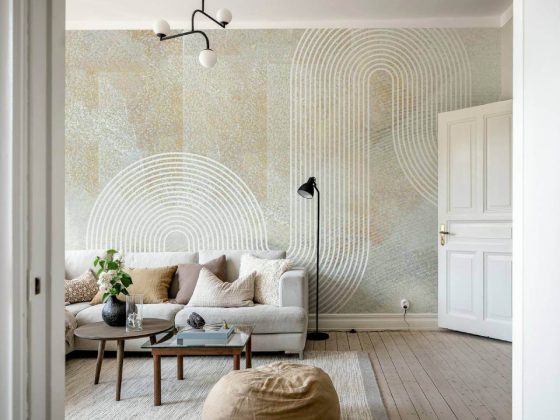
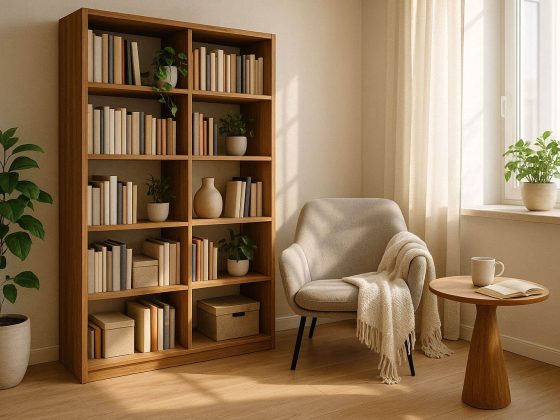
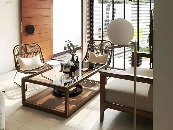
Japandi Color Palette for Living Rooms
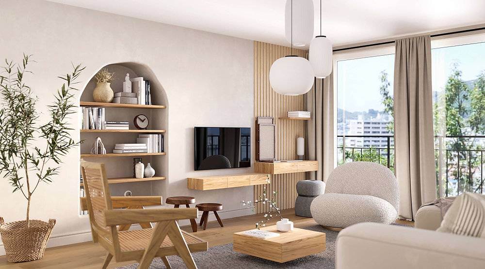
First up is the living room. This is where you relax, entertain, and unwind, so it’s the perfect place to embrace the Japandi paint colors. Start with a base of Creamy White or Warm Beige for the walls to create a bright, open feel. Then, add depth with Muted Gray furniture or a Charcoal Gray accent wall.
To bring in natural textures, you can try a Warm Taupe rug or a wooden coffee table. Finally, add some pops of Sage Green or Moss Green through throw pillows, plants, or artwork.
Read more: Japandi Living Room Ideas for a Chic Minimalist Home.
Japandi Color Palette for Bedrooms
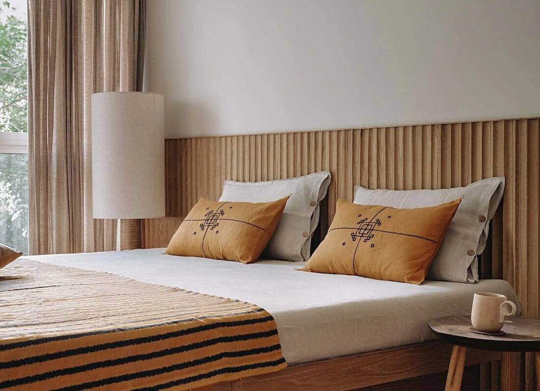
Next, let’s talk about the bedroom. This space should feel like a sanctuary, and the Japandi palette is perfect for creating that calming vibe. Begin with Creamy White or Blush Sand walls for a soft, warm backdrop. Then, choose bedding in Warm Beige or Muted Gray to make the room feel cozy and inviting.
For added depth, consider a Charcoal Gray headboard or nightstand. Don’t forget to bring in natural elements, like a Golden Straw throw blanket or Earthy Clay decor accents. Finish with a few Sage Green plants to add a touch of nature.
Read more: 10 Minimalist Japandi Bedroom Ideas for a Calming Refuge.
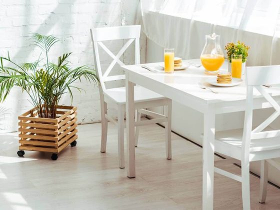
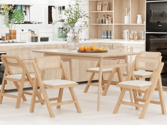
Japandi Color Palette for Kitchens
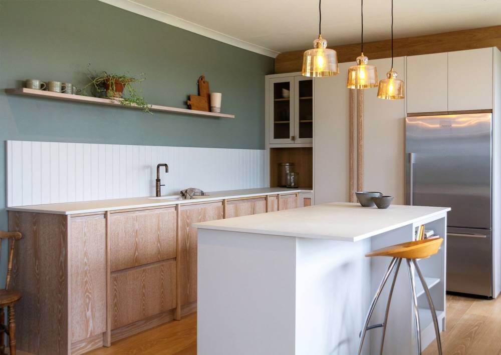
Your kitchen is the heart of your home and should feel warm and inviting. You can start by adding a Creamy White or Muted Gray cabinets for a clean, minimalist look. Then, enhance the warmth by choosing a backsplash or countertop in Warm Taupe or Golden Straw.
For contrast, use Charcoal Gray for hardware or lighting fixtures. Finally, you should introduce natural textures with wooden shelves or a Moss Green plant on the windowsill.
Read more: 9 Japandi Kitchen Design Ideas for a Calm, Cozy Cooking Space.
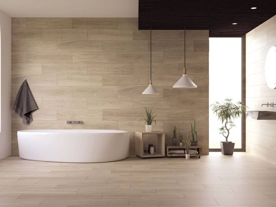
Japandi Color Palette for Bathrooms
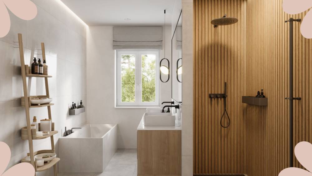
Your bathroom can also benefit from the Japandi palette. To create a spa-like retreat, use Creamy White or Muted Gray for the walls and tiles. This will give you a clean, calming base. Then, add warmth with Warm Beige towels or a Blush Sand shower curtain.
For a modern touch, use Charcoal Gray for fixtures or accents. Don’t forget to bring in natural elements, like a Sage Green plant or wooden storage baskets.
Read more: 10 Japandi Bathroom Ideas for a Minimalist & Spa-Like Retreat.
Japandi Color Palette for Exteriors

Last but not least, let’s talk about the exterior of your home. The Japandi palette can create a welcoming and cohesive look here, too. Start with Creamy White or Warm Beige for the main walls to create a bright, inviting feel. Then, add depth with Charcoal Gray shutters or a front door.
For more contrast, try using Muted Gray or Earthy Clay for the roof or trim. Finally, you should introduce natural elements with wooden accents or Moss Green plants in the landscaping.
Japandi Paint Colors: Best Picks from Benjamin Moore & Sherwin Williams
If you’re ready to bring the Japandi color palette into your home, choosing the right paint colors is key. To make it easy for you, we’ve curated a list of the best Japandi-inspired paint colors from Benjamin Moore and Sherwin Williams, the two biggest paint brands in the US.
Benjamin Moore Picks
Simply White (OC-117)
- What it is: A warm, soft white color perfect for creating a bright and airy feel.
- How to use it: It is ideal for walls, ceilings, or trim in living rooms, bedrooms, or kitchens. It pairs beautifully with natural wood tones and earthy accents.
Edgecomb Gray (HC-173)
- What it is: A warm, neutral gray with beige undertones.
- How to use it: It is great for living rooms, bedrooms, or bathrooms. Use it on walls or furniture to add a cozy, grounded feel.
Pale Oak (OC-20)
- What it is: A soft, warm gray that works as a neutral base.
- How to use it: Perfect for open-concept spaces or bedrooms. Pair it with Creamy White trim for a clean, balanced look.
Sage Green (HC-125)
- What it is: A muted, earthy green that brings a touch of nature indoors.
- How to use it: It should be used as an accent wall in living rooms, bedrooms, or bathrooms. It pairs well with warm wood tones and neutral textiles.
Sherwin Williams Picks
Alabaster (SW 7008)
- What it is: A warm, creamy white that’s soft and inviting.
- How to use it: It is perfect for walls, ceilings, or trim in any room. It creates a serene backdrop for Japandi-inspired decor.
Agreeable Gray (SW 7029)
- What it is: A warm, neutral gray with beige undertones.
- How to use it: It is ideal for living rooms, bedrooms, or kitchens. Use it on walls or furniture to add depth and sophistication.
Sea Salt (SW 6204)
- What it is: A soft, muted green with gray undertones.
- How to use it: Great for bathrooms, bedrooms, or accent walls. It adds a calming, spa-like feel to any space.
Urbane Bronze (SW 7048)
- What it is: A deep, warm gray with brown undertones.
- How to use it: Use it sparingly for accent walls, furniture, or exterior shutters. It adds contrast and a modern edge to Japandi spaces.
Final Thoughts!
And there you have it—everything you need to know about the Japandi color palette! It’s a simple, beautiful way to create a home that feels calm, cozy, and stylish. Whether you’re redecorating your living room, bedroom, or even the exterior of your home, these colors will work their magic.
So, what are you waiting for? Grab some paint samples, and pick your favorite Japandi colors to transform your space today. Trust me, your home (and your mind) will thank you!
So, which Japandi colors do you love the most? Let us know in the comments!